OVERVIEW
This is the concept design for the Apple's merchandise to enhance the existing store experience by adding a little bit of a spice.
OBSERVATION
I've visited their flagship store in San Francisco many times and loved how I can experience their products in the very spacious space.
People are coming from all over the world and try beautiful apple products with full of curiosity.
With the all of the great experience, I felt that space could be improved by guiding people with a bit of the communication design.
The current space design is simple and clean but at the glance when you just step in the store, you would feel a bit of the confusion as the space is very big and so many products on the many tables.
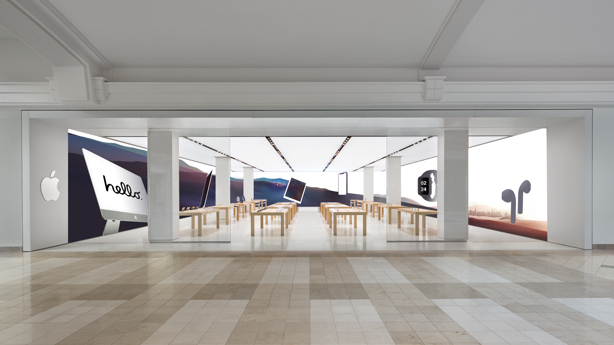
INSIGHT
• Adding the new graphical signage on the walls to give the people to see whole products line-up at a glance when they step into the store.
• The new signage would increase the chance to guide them for going through their product ecosystem as oppose to see only the product that customer wanted to see.
• Each retail could have their identity by adding local landmarks in the graphical signage like Golden gate bridge and Downtown cityscape in San Francisco in the example below to create the intimacy with customers.